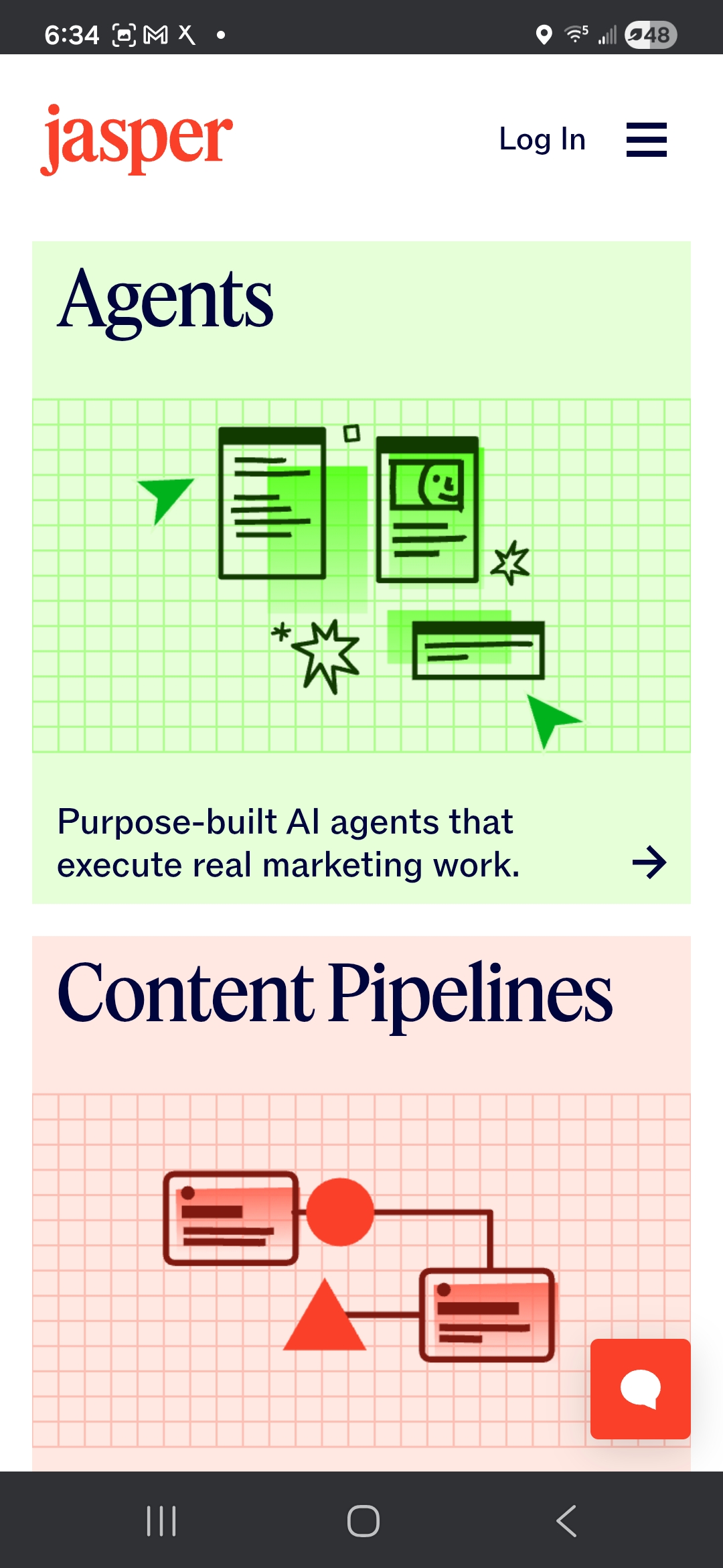
A CLOSE READ OF JASPER.

Audit TypeBrand Experience
ScopeHomepage + Platform walkthrough
DeliverablesStrategic audit + audio walkthrough
Jasper website
The Brief

Jasper landed on my radar because of how different it looked. I opened the site expecting the standard AI-marketing look and got something else entirely. Editorial textures, custom interactive HTML, a five-item nav that opens into real depth on hover. Most of the category runs gradient-and-mesh visuals and calls it a day. Jasper picked a different lane. These are design choices, not defaults. That’s the kind of opinionated work I keep showing up for.

The walkthrough

Let me show you what I mean.

The homepage

Craft on arrival.

Five-item nav. Editorial graphics that don’t look stock. A customer scroll-reel carrying Prudential, Ulta, Wayfair, iHeart, Boeing, Adidas. The hero line “Put AI agents to work for marketing” lands clean, and the slider underneath it walks through real use cases. I started reading and kept reading. One thing tugging at me: the logos on the “world-class marketing teams that trust Jasper” row sit quieter than the hero graphic above them. On a scroll reel that’s carrying the Fortune 500, those lockups could breathe at the same weight the hero takes up.

Jasper.ai homepage with editorial hero graphic and five-item nav
1
Editorial hero. Not stock.
2
Fortune 500 logos sit too quiet.
Jasper Platform page with Agents, Content Pipelines, and Jasper IQ pillars
1
Add a breadcrumb. Platform / Agents / Optimization.
2
Dense, but the density feels like a real product tour.
Explore the Platform

A place to land.

I clicked “Explore the Platform” for the answer to “how does this actually work.” The click put me somewhere I didn’t expect. A dense three-pillar architecture: Agents, Content Pipelines, Jasper IQ. Then Canvas. Then back to Platform when I tried to find home. The content is here and it’s rich. The wayfinding is the part I kept reaching for. A light breadcrumb pattern (Platform / Agents / Optimization) would let a first-time reader infer where they are and get back without hunting. Same visual language, cleaner sense of place.

The agent cards

Cleanest block on the Platform.

The agent cards are the cleanest block on the Platform page. Tight cards, confident typography, a grid that lets each agent sit with its own weight. You can feel the system underneath the visual language. The part I’d layer in: the names (Optimization, Personalization, Research) are precise for a current user and a little opaque for a first-time reader. One short italic line above each name in plain-language use-case framing would carry a stranger through the same cards without touching the design.

Jasper agent cards grid — Optimization, Personalization, Research
1
Confident typography. Grid lets each card sit with its own weight.
2
Add one italic line of plain-language framing above each name.
On mobile

Easier than desktop, honestly.

Notes for the team
  • The persistent “State of AI in Marketing 2026” banner doesn’t have a close affordance on mobile that I could find.
  • The “world-class marketing teams” section carries the same vertical-space gap from desktop, which suggests it’s a design intent rather than a desktop-only layout quirk.
  • The Agents-page flip (01) is the most useful observation in the whole audit; the mobile pacing is doing comprehension work that would translate back to desktop if the team wanted to borrow it.
Jasper mobile — Agents page, column-collapsed scroll
The audit

What’s working, what’s not, and what I’d love to help finish.

Jasper brand audit / 2 min listen

0:00--:--
Jasper ∗ Jasper ∗ Jasper ∗ Jasper ∗ Jasper ∗ Jasper ∗ Jasper ∗ Jasper ∗ Jasper ∗ Jasper ∗ Jasper ∗ Jasper ∗ Jasper ∗ Jasper ∗ Jasper ∗ Jasper ∗
What's Working

I keep coming back to what works.

01

The editorial texture.

Most AI-category brands run gradient-and-mesh visuals and call it a day. Jasper picked a different lane, editorial graphics with real texture and custom art direction, and the site holds that lane from the hero all the way down.

02

The five-item nav.

Short on the surface, deep on hover. Three ways into the Solutions pages (use case, role, industry) is a smart read on who the buyer is. Exactly right.

03

The brand style guide at jasper.ai/brand.

Publishing a brand system in public is not a standard move in B2B AI. It reads as a team that takes brand seriously enough to version it where anyone can see it. Small thing, big signal.

04

The customer scroll-reel.

Prudential, Ulta, Wayfair, iHeart, Boeing, Adidas. The Fortune 500 weight is there. Great placement on the homepage. The logos would land even harder at hero-graphic scale.

05

The confidence of the visual system.

Whoever set the direction here knew exactly what they were reaching for. The craft bar is legible from outside the company, and that’s what made me keep scrolling instead of bouncing.

Detail from the Jasper audit
[04]Opportunities

The parts I loved. The friction I hit. The list I’d ship.

05 Areas
01 / Opportunity

Signal the drag

Canvas is fully draggable and the draggability is invisible until you bump into it. A small cursor affordance, a one-line micro-label, or a brief animated hint on first visit would surface the interaction for people who’ll scroll past an unmarked one. Without changing the freeform feel.

02 / Opportunity

Name the agent’s job

The agent cards (Optimization, Personalization, Research) are named cleanly for a current user and opaquely for a first-time reader. One short italic line above each name in plain-language use-case framing (“For marketers who need to adapt content faster across markets”) would carry a stranger through the same cards without changing the design system.

03 / Opportunity

Show the mechanism under the stat

The 67% traffic-increase claim is boldly set and confidently placed. Underneath it, a single expandable “see how” opens to one paragraph on the mechanism the agent uses. Keeps the claim bold. Puts the proof within one click of it. Reads as confidence, not hedging.

04 / Opportunity

Anchor the Platform page

The Platform page is dense, and the density is part of what makes it feel like a real product tour. A short plain-language section at the top, two sentences, called something like “How a Jasper agent runs in one sitting,” would let a stranger land before diving into the three pillars. The density stays. The on-ramp appears.

05 / Opportunity

Rewrite the Platform section header

The Platform page opens with “Purpose-built AI agents.” Precise for the team, flat for a first-time reader. A rewrite to “How our purpose-built AI agents execute real marketing work” keeps the precision and adds the verb, which is where a stranger’s comprehension lives. Content design, not redesign.

THE CRAFT

YOU’RE CARRYING.

Jasper shipped a rebrand, three new product surfaces, and a full agentic repositioning inside a year. The brand is carrying real commercial work for Wayfair, Boeing, Adidas, iHeart, and around 20% of the Fortune 500. “Too much” is the right amount for that buyer. The craft is on purpose, and it’s working. What I’d add isn’t less. It’s a quiet, persistent comprehension layer under the craft layer, the way Stripe and Linear already carry both. Heavy visual work on top, a plain-language handrail underneath. The craft stays loud. A curious stranger gets a place to land. A returning user gets exactly what they already had. After 14 years on brand systems and campaign work, that comprehension layer under the craft is exactly the kind of problem I love to sit with — if you’re building something worth finishing, that’s my favorite kind of project.

Quierra Wells

Quierra Wells

Design Director & Creative Technologist

View full profile
An outsider’s read

Let's talk.

Quierra Wells. Happy to talk shop.